( Client Project )
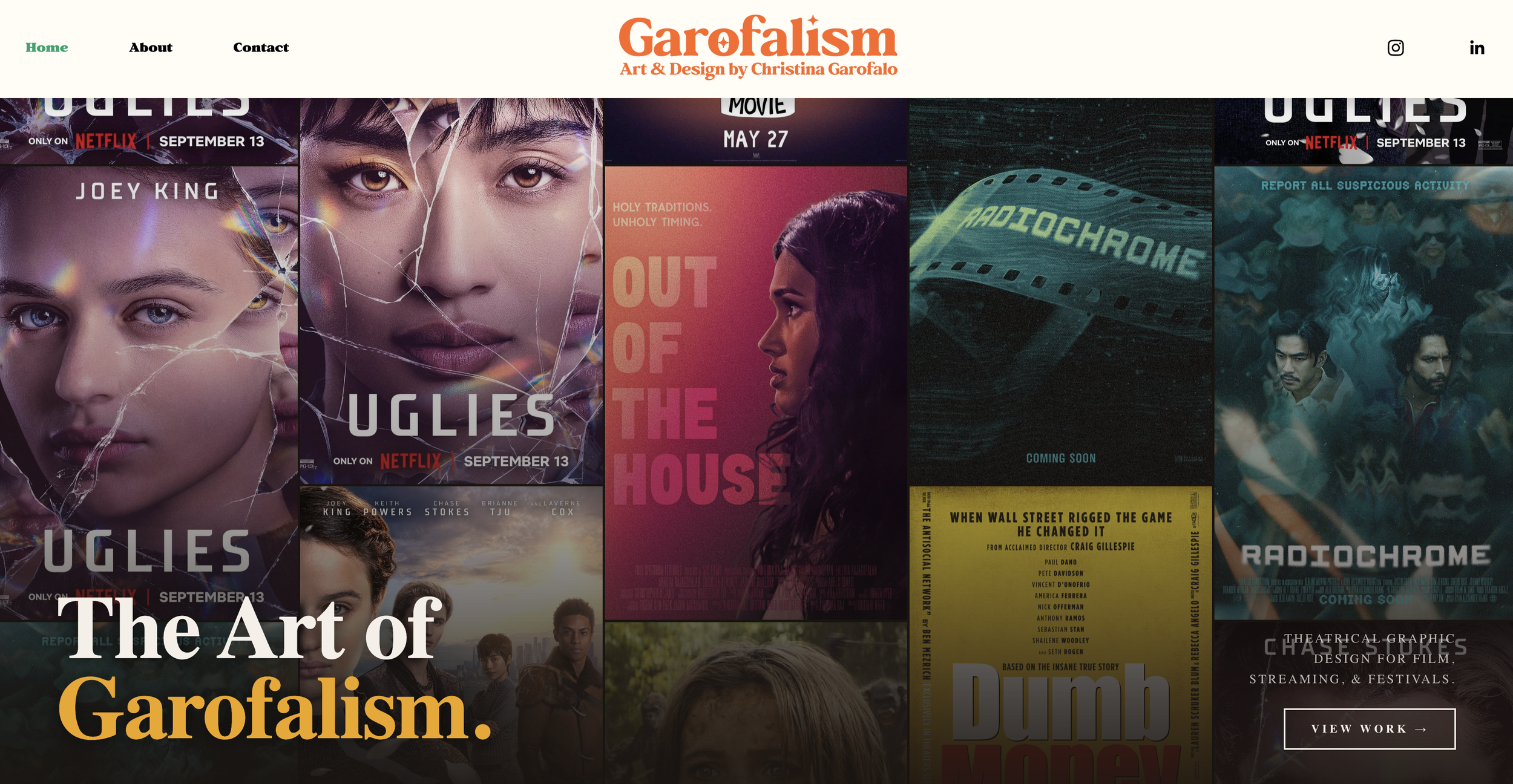
Garofalism
About
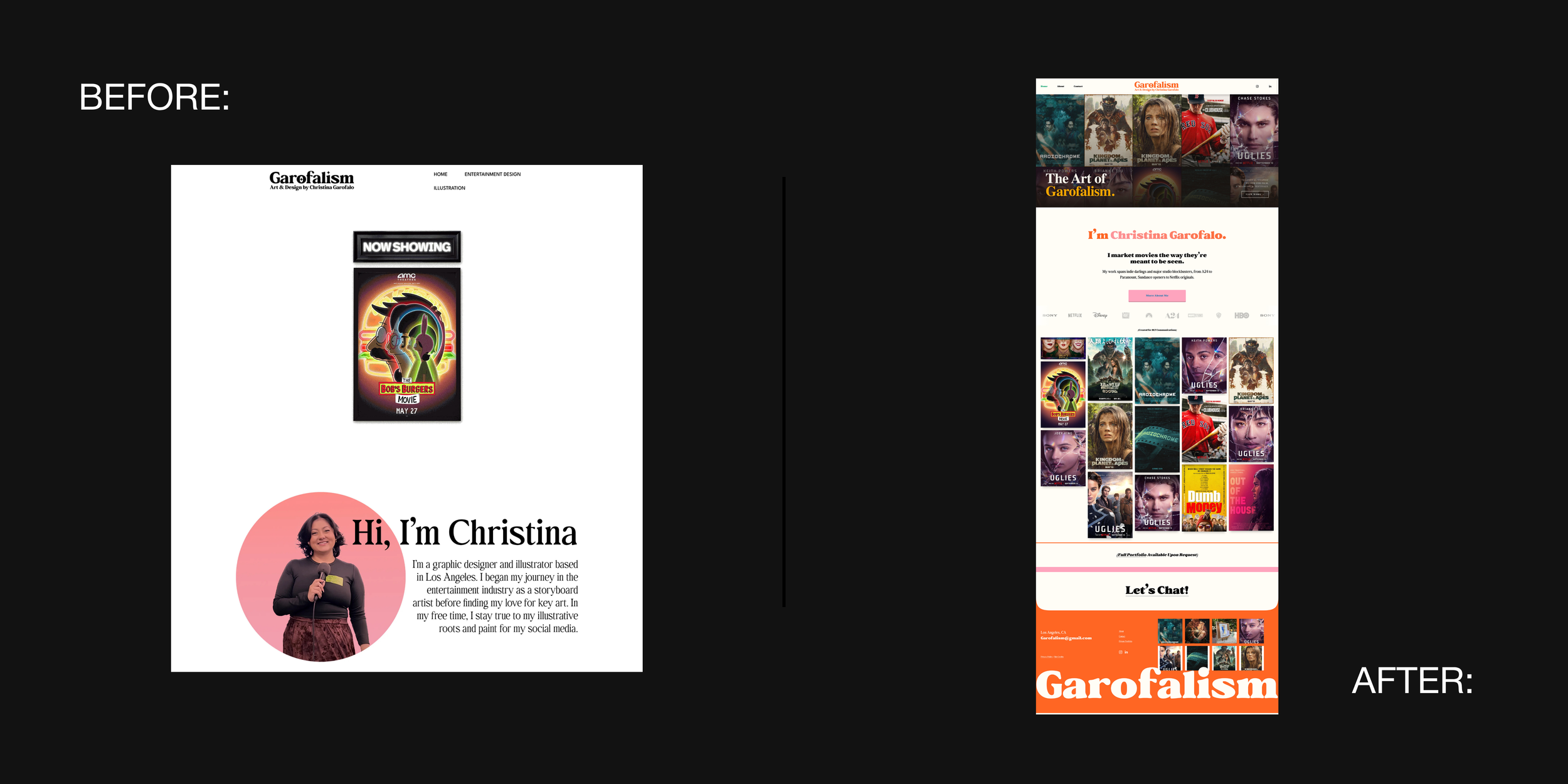
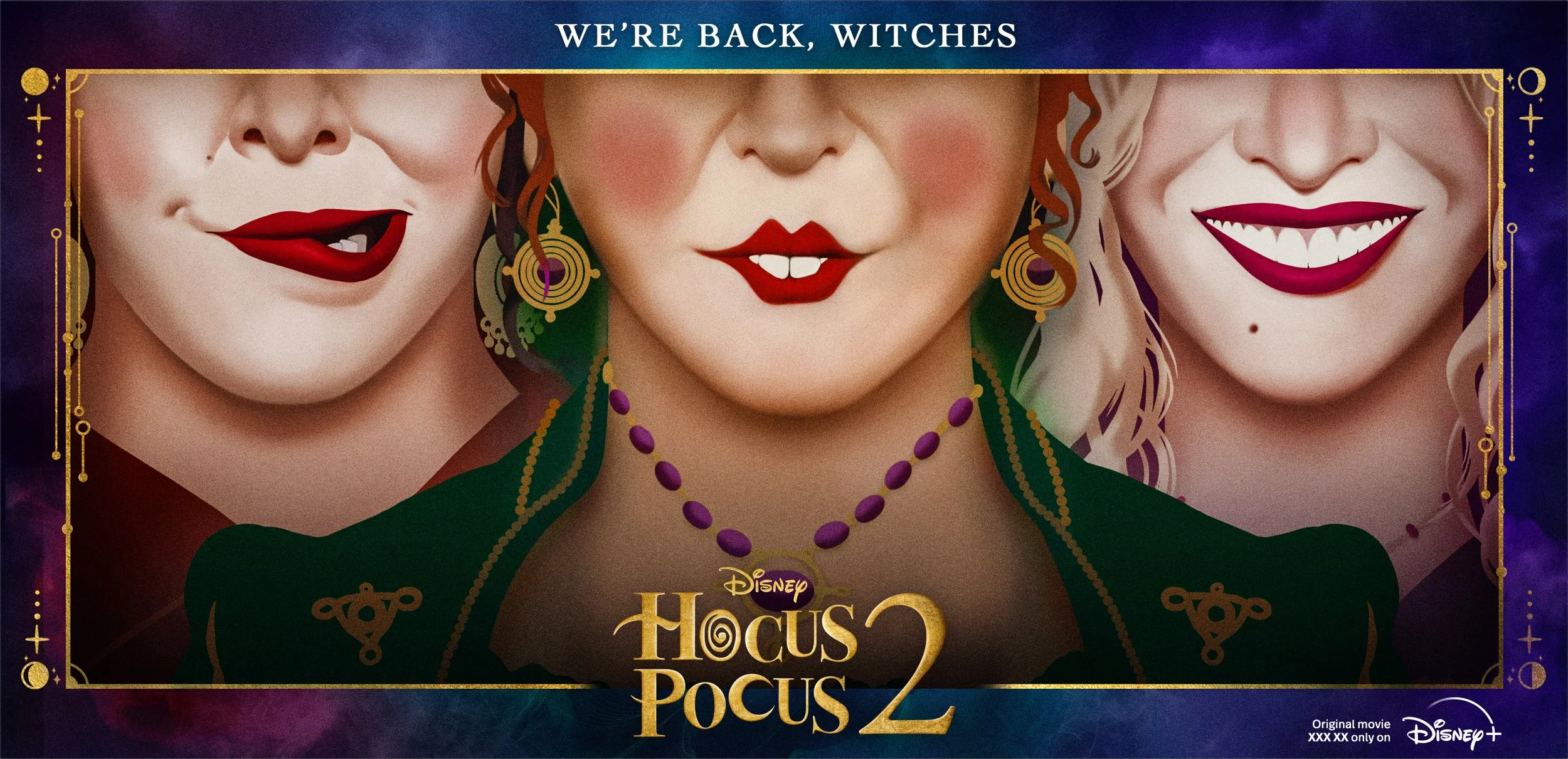
Christina Garofalo (Garofalism) is a Hollywood key art designer whose work has graced the campaigns of the biggest studios in the industry — from major theatrical releases to prestige streaming titles. A visual storyteller by trade, she came to Knight Theory™ with a challenge that felt almost paradoxical: she needed a portfolio site bold enough to reflect her personality, but restrained enough that her art (not the website) would always be the star of the show.
She also needed two distinct worlds to coexist in one: a public-facing gallery for the work she's proud to show everyone, and a private, gated portal for high-profile studio clients to access exclusive key art and campaign materials.
*Art Created for BLT Communications
YEAR
2026 (2 Week Timeline)
PACKAGE
Custom Project
day 01
understanding the duality
We started where every great campaign does: with the brief. Her work lives at the intersection of commerce and cinema, and her website needed to do the same. The goal wasn't just to showcase a portfolio; it was to create a destination, one that communicates prestige at a glance while giving major clients the confidence to trust her with their biggest titles.
We gathered her moodboard, her inspiration, and her goals, and mapped out two user journeys side by side: the public visitor discovering her world, and the studio exec logging in to view protected deliverables. Both experiences needed to feel premium and intentional.
The goal: for Christina (and her work) to own the room before she walks into it.

Week 01
bold by design, not by accident
Color was the creative heart of this project. She loves bold, saturated hues, and even had some incredible color palette ideas top of brain. But a movie poster designer knows better than anyone that balance is always needed, and the art always has to win.
We approached the palette the way a great production designer approaches a set: bold color as architecture, not decoration. Deep, confident accent tones were applied to structural elements (navigation, dividers, typographic moments) creating a strong visual personality without ever competing with the imagery itself. The result is a site that feels vibrant and unmistakably hers, while still giving every piece of key art the clean breathing room it deserves.
Week 02
a portfolio built for two audiences
The public gallery was designed to move like a cinematic reel—immersive, image-forward, and carefully sequenced. We utilized clean layouts and generous negative space to ensure the focus remains entirely on her released projects.
The private portfolio required a more strategic approach. We built a secure, password-protected portal specifically for her unpublished work and sensitive campaign materials. This allows Christina to share high-profile, more under wraps deliverables with executives through a professional and discreet interface.
End of Week 02
handoff & scale
We closed with a tailored training video so she could independently update her public gallery as new credits roll in without compromising the design system we built together. A brand guideline sheet ensures every new addition she makes lands consistently, whether it's a prestige drama or a summer blockbuster.
A site as cinematic as the work inside it—bold enough to make a statement, disciplined enough to let the art speak.
VISIT www.garofalism.com